Starting to create the magazine
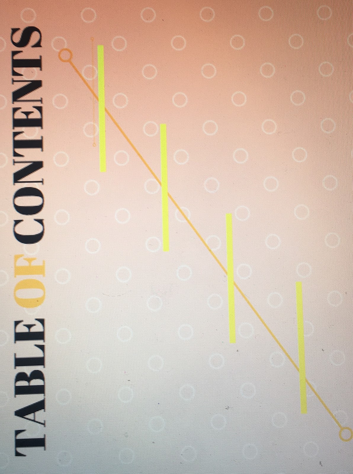
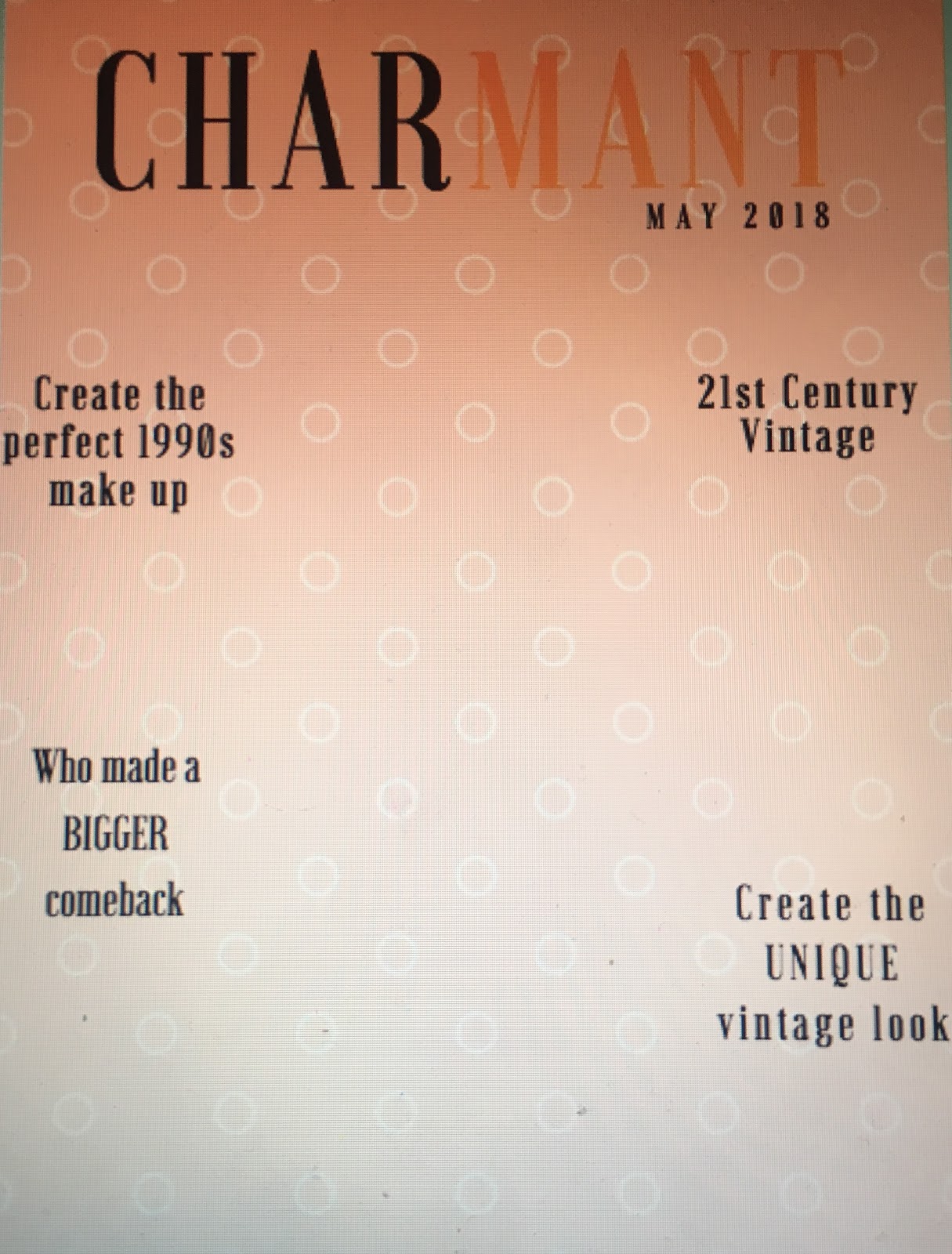 Right now, I am starting to set up the layout of my magazine. The font I chose is very classic and clean. The lettering colour is black with a mix of orange. I decided to include orange to try and see how I can make it a playful layout. I have put all the cover lines of the front page. I might make some changes when I include the front image. I mimic the sketch that my partner and I made of the Table of Contents. I tried to make it look more clean instead of cut and pasted the lines. I will have to revise the table of contents, but I will do it when I see my partner so we can have a more similar table of contents to show cohesiveness between the two.
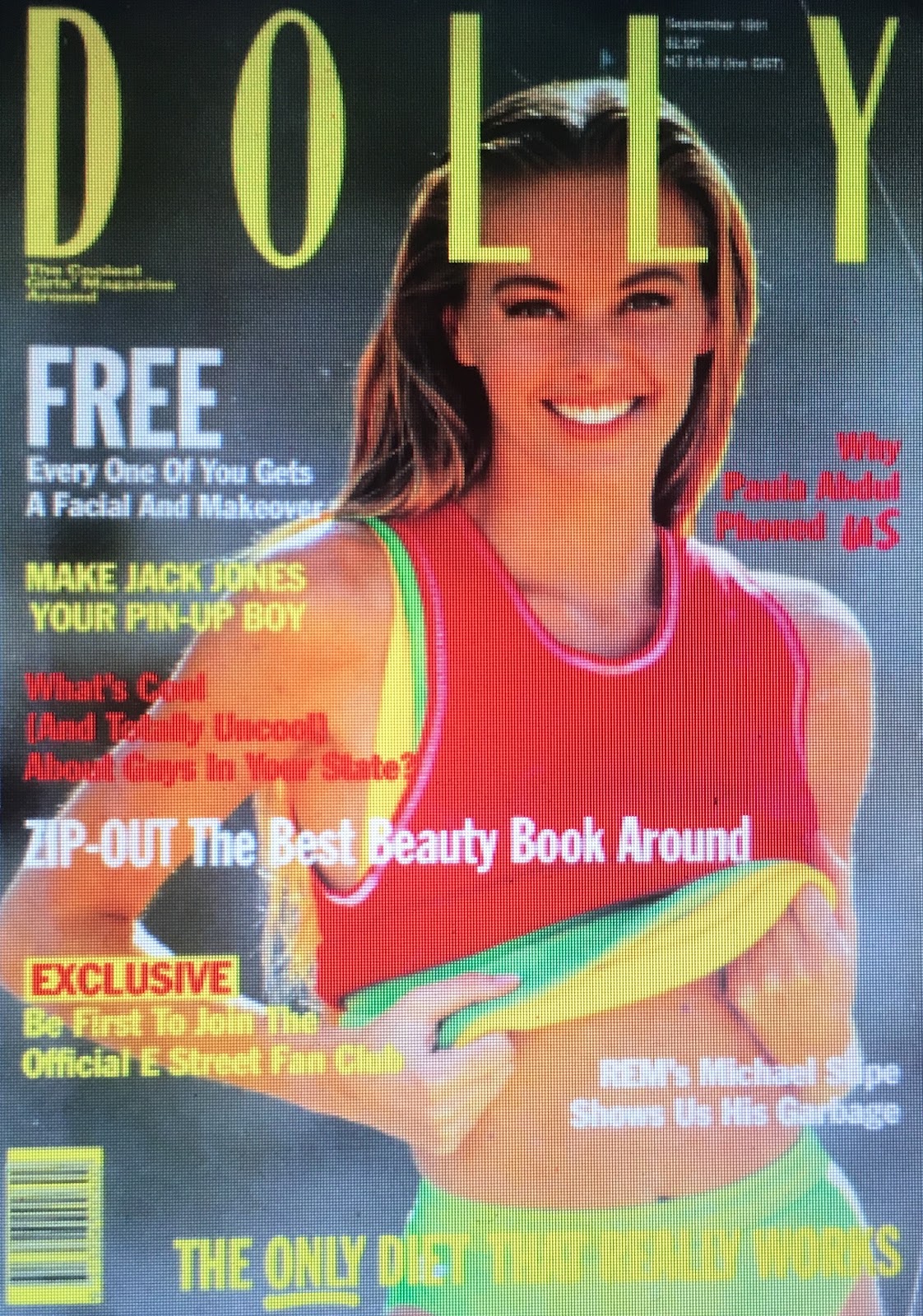
 I am having a bit of trouble creating the layout of the two page spread. I want it to be different, but also have a vintage feeling to it. For right now it have the title that is boxed around. The boxes around the titles remind me a little bit of vintage, but I think I will be making revisions on the two page spread. I will brainstorm more ideas on how to set up the layout. I will ask my partner for advice and which layout is appealing to the eye and more organised. Looking at some magazines from the 1990s, I noticed that the headings are of different colours and the background is simple. I will kinda mimic the look of the magazines, but also have a more modern twist to it so it is attractive to the people today. I think having the mix is important because it is manipulating a vintage look to a modern feel to it.
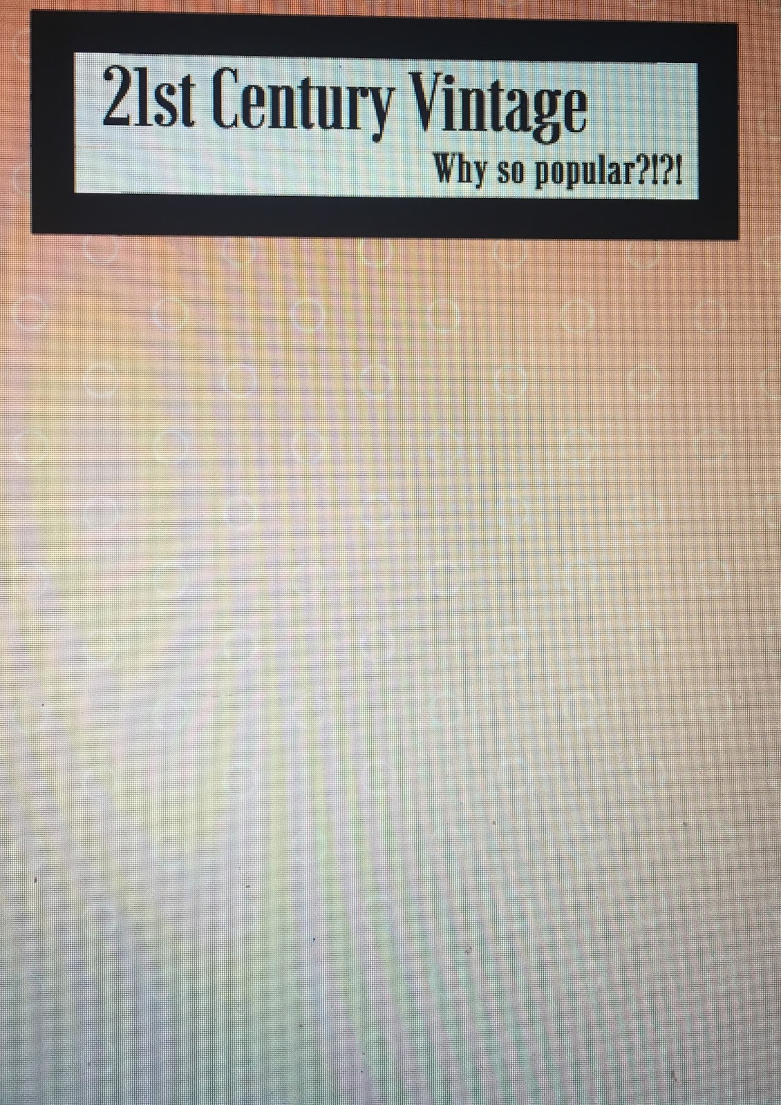
Citations: Vermaak, Christelle. “Books, Movies, Tv Progams and Magazines.” Pinterest, 6 Oct. 2016, www.pinterest.com/pin/418131146638294762.

Comments
Post a Comment